ShopDreamUp AI ArtDreamUp
Deviation Actions


Suggested Deviants


Suggested Collections


![Cutesu Commission [1/2]](https://images-wixmp-ed30a86b8c4ca887773594c2.wixmp.com/f/2f789199-09fe-4339-b6d5-f8a7854fa8bc/d8vrh9e-18dc1e1c-f708-44d1-99b9-465c2c8a43cd.png/v1/crop/w_184,h_184,x_0,y_28,scl_0.23320659062104/cutesu_commission__1_2__by_pemiin_d8vrh9e-92s-2x.png?token=eyJ0eXAiOiJKV1QiLCJhbGciOiJIUzI1NiJ9.eyJzdWIiOiJ1cm46YXBwOjdlMGQxODg5ODIyNjQzNzNhNWYwZDQxNWVhMGQyNmUwIiwiaXNzIjoidXJuOmFwcDo3ZTBkMTg4OTgyMjY0MzczYTVmMGQ0MTVlYTBkMjZlMCIsIm9iaiI6W1t7ImhlaWdodCI6Ijw9OTY2IiwicGF0aCI6IlwvZlwvMmY3ODkxOTktMDlmZS00MzM5LWI2ZDUtZjhhNzg1NGZhOGJjXC9kOHZyaDllLTE4ZGMxZTFjLWY3MDgtNDRkMS05OWI5LTQ2NWMyYzhhNDNjZC5wbmciLCJ3aWR0aCI6Ijw9NjAwIn1dXSwiYXVkIjpbInVybjpzZXJ2aWNlOmltYWdlLm9wZXJhdGlvbnMiXX0.2Z8TjE9mpjIyhsW0XJghomcqhwJ_XTeOcyxlyQi7f2c)
![Cutesu Commission [1/2]](https://images-wixmp-ed30a86b8c4ca887773594c2.wixmp.com/f/2f789199-09fe-4339-b6d5-f8a7854fa8bc/d8vrh9e-18dc1e1c-f708-44d1-99b9-465c2c8a43cd.png/v1/crop/w_92,h_92,x_0,y_14,scl_0.11660329531052/cutesu_commission__1_2__by_pemiin_d8vrh9e-92s.png?token=eyJ0eXAiOiJKV1QiLCJhbGciOiJIUzI1NiJ9.eyJzdWIiOiJ1cm46YXBwOjdlMGQxODg5ODIyNjQzNzNhNWYwZDQxNWVhMGQyNmUwIiwiaXNzIjoidXJuOmFwcDo3ZTBkMTg4OTgyMjY0MzczYTVmMGQ0MTVlYTBkMjZlMCIsIm9iaiI6W1t7ImhlaWdodCI6Ijw9OTY2IiwicGF0aCI6IlwvZlwvMmY3ODkxOTktMDlmZS00MzM5LWI2ZDUtZjhhNzg1NGZhOGJjXC9kOHZyaDllLTE4ZGMxZTFjLWY3MDgtNDRkMS05OWI5LTQ2NWMyYzhhNDNjZC5wbmciLCJ3aWR0aCI6Ijw9NjAwIn1dXSwiYXVkIjpbInVybjpzZXJ2aWNlOmltYWdlLm9wZXJhdGlvbnMiXX0.2Z8TjE9mpjIyhsW0XJghomcqhwJ_XTeOcyxlyQi7f2c)


You Might Like…


Featured in Groups


Description
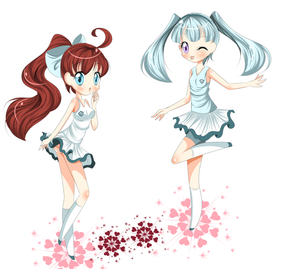
Aki and Mila wearing cute and sexy tennis outfits. <3
Also, panty shot. Mila didn't tell Aki she should wear shorts under her dress.
I own both characters.
Brushes (c)
Also, panty shot.
Mila didn't tell Aki she should wear shorts under her dress.I own both characters.
Brushes (c)
Image size
2300x2200px 1.58 MB
© 2011 - 2024 Amai--Kiss
Comments36
Join the community to add your comment. Already a deviant? Log In
CRITIQUE? YE SHALL RECEIVE ONE. O:<!
Vision : First off, the details you put into these are absolutely stunning. The line art is thin and gives good feel to the entire picture. However! Certain things lack detail, such as their hands, ears, and the line art for the hair. I believe if you put more folds into the hair line art, they would match better with the many lines you use to color and shade it. Remember, the lines should introduce depth! It's not simply an outline for you to color.
I also believe it would be good for you to sharpen up on your hand anatomy and maybe putting a little more detail into the ears. You could also add a little more detail to the socks, whether it be wrinkles or designs. Perhaps you could put more folds into the inner part of the ribbon. And put more shading on their faces and upper bodies (the skin, not the clothes, haha).
Another thing I noticed is that you have a hard time transitioning from one piece of clothing to another. For example, around the hips where the shirt and skirt connect looks a bit strange. If the shirt is tight, it should suction to the shape of their bodies. If it's loose, then you should add more depth to the opening at the bottom to show it's loose. Instead of ending the lines at a point, you should curve it a bit more to add more depth.
Last, but not least, I believe you should try to adapt to a light source. Your shading is beautiful, but many times confusing. Start off by trying simple light sources, such as from the side. If the light appears on one side, then the shading should all be on the other side. Don't be afraid to add lots of shading! It gives good depth and feel to the picture. And it's easy to tell when you've over-detailed the picture, trust me. I can't really tell what you used to shade the white parts, but you should use a light blue tone to do so. It gives more color than grey and invites you into the picture a bit more. Unless the actual color you're shading is black, I advise you to stay away from shading with black tones in order to avoid a negative feel in the picture.
Originality : Your style is very unique. It's beautiful and obviously has good potential and skill. I believe you could put a little more thought into the designing on their clothing, however. Because of your skills in being very detailed, I believe it would benefit you to put more details in the actual design of the clothing instead of just adding immense amounts of wrinkles.
Technique : The way you color and shade goes along beautifully with your line art. Once again, you have a very unique style, and that isn't bad at all! Your shading goes along with your lines for the most part, minus the hair and odd light sources. You seem to have a very sure path for your lines. It seems you put a lot of effort in detailing and line art. Personally, I especially love the eyes you do. They're large and beautiful and so artistically done. You're spot-on with expressions.
I assume you use references quite often due to how much you talk about them. (Lol. xD) Use references for anatomy the most, but I highly encourage you to try and visualize it for yourself without using any every once in a while. Soon enough, you'll be able to get anatomy down without referencing. It's a good skill to adapt to. (I never really had anything to reference to, so I did this all without anything. It's really handy. xD I even learned how to do hands without referencing! .o.) I'm sure you'll get it down if you do it more. If you try to copy the pose of a reference, it might turn out odd if you don't get it perfect, so it's good to adapt vivid visualization.
Impact : Cute! Adorable! You must be thinking, "Wow, I never imagined I had that many things to work on." But even though I (really, really, really) broke down into a lot of detail on stuff you could work on, you still manage to nail the major intention of the picture. They're adorable and sexy, and you obviously have a lot of skill. The only things I can think of, however, that you could use to make the picture more interesting would be dynamic perspective and a background (but even I'm working on these, so don't feel bad about not doing any xD). Otherwise, you did a lovely job overall, and I look forward to seeing you improve!
Hope this helps.~ I'm sorry it's so large. ;_; I really didn't mean for it to be, but I'm detail-oriented. xD Anyway, nice job! Aki's sexy, Mila's cute; all is well. n.n